I've been a copywriter since 2019. First as a UX copywriter in the startup space and most recently as a copywriter for Converse.
I chose the following samples to showcase my range.
For almost 4 years, I wrote for Converse—everything from product copy, to site, email, SMS, and social copy.
Scroll down to see samples.
paid social
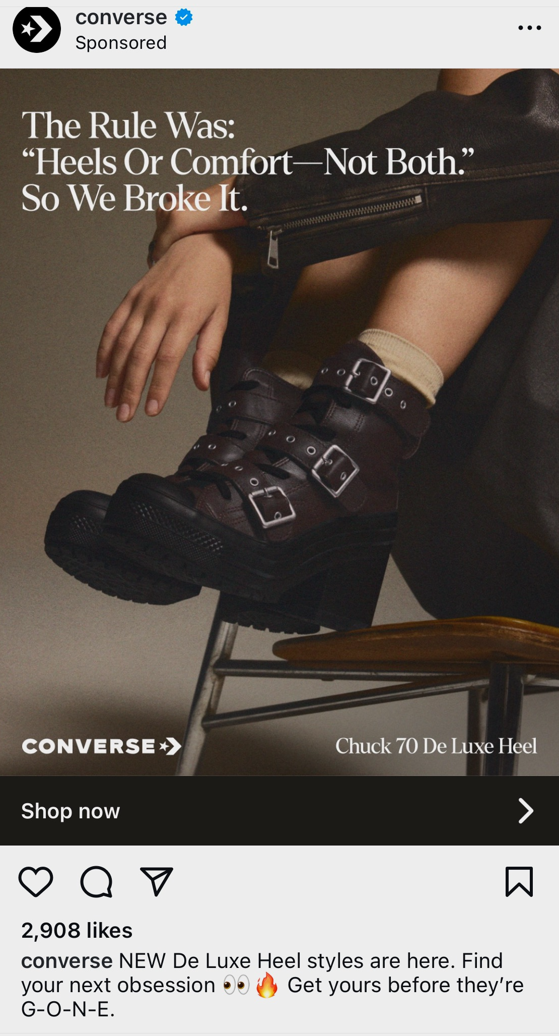
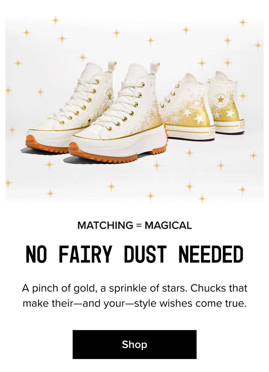
IG paid ad: CHUCK 70 De Luxe Heel
For a heel unlike most, I wanted the writing to feel the same.
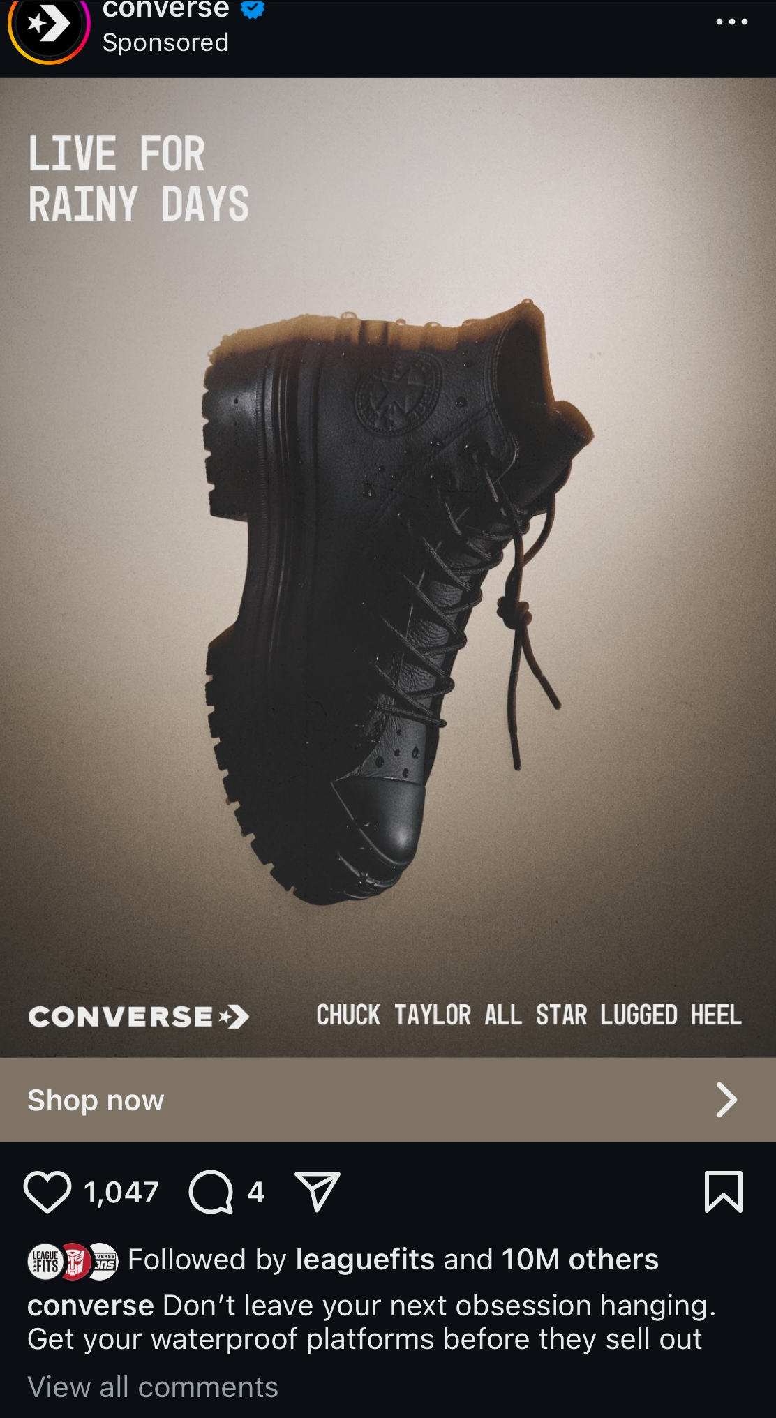
IG paid ad: Chuck Taylor all star lugged heel
Since the image doesn't instantly scream "waterproof," the copy does.
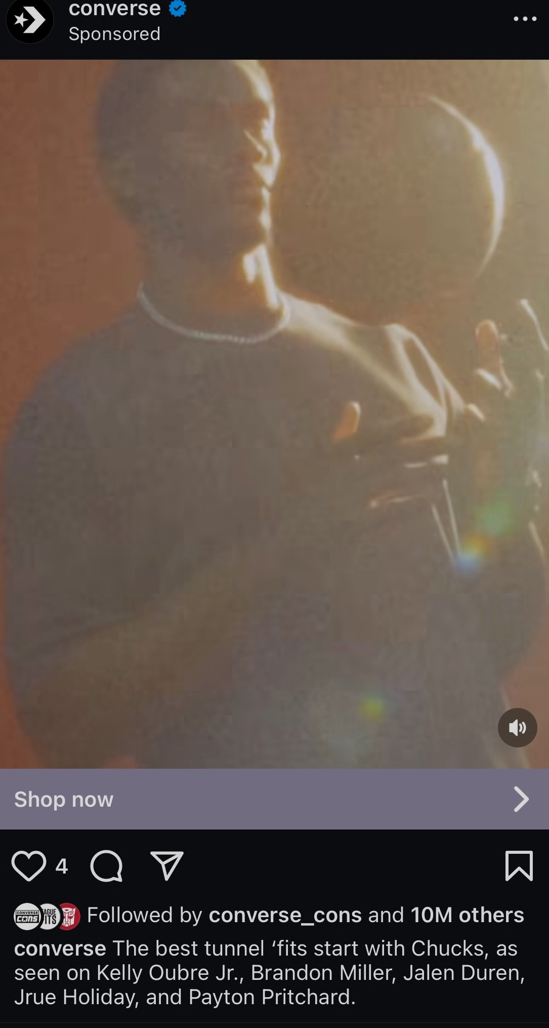
IG paid ad: classic chucks/tunnel 'fits
The concept: the most stylish players, in the tunnel, in Chucks.
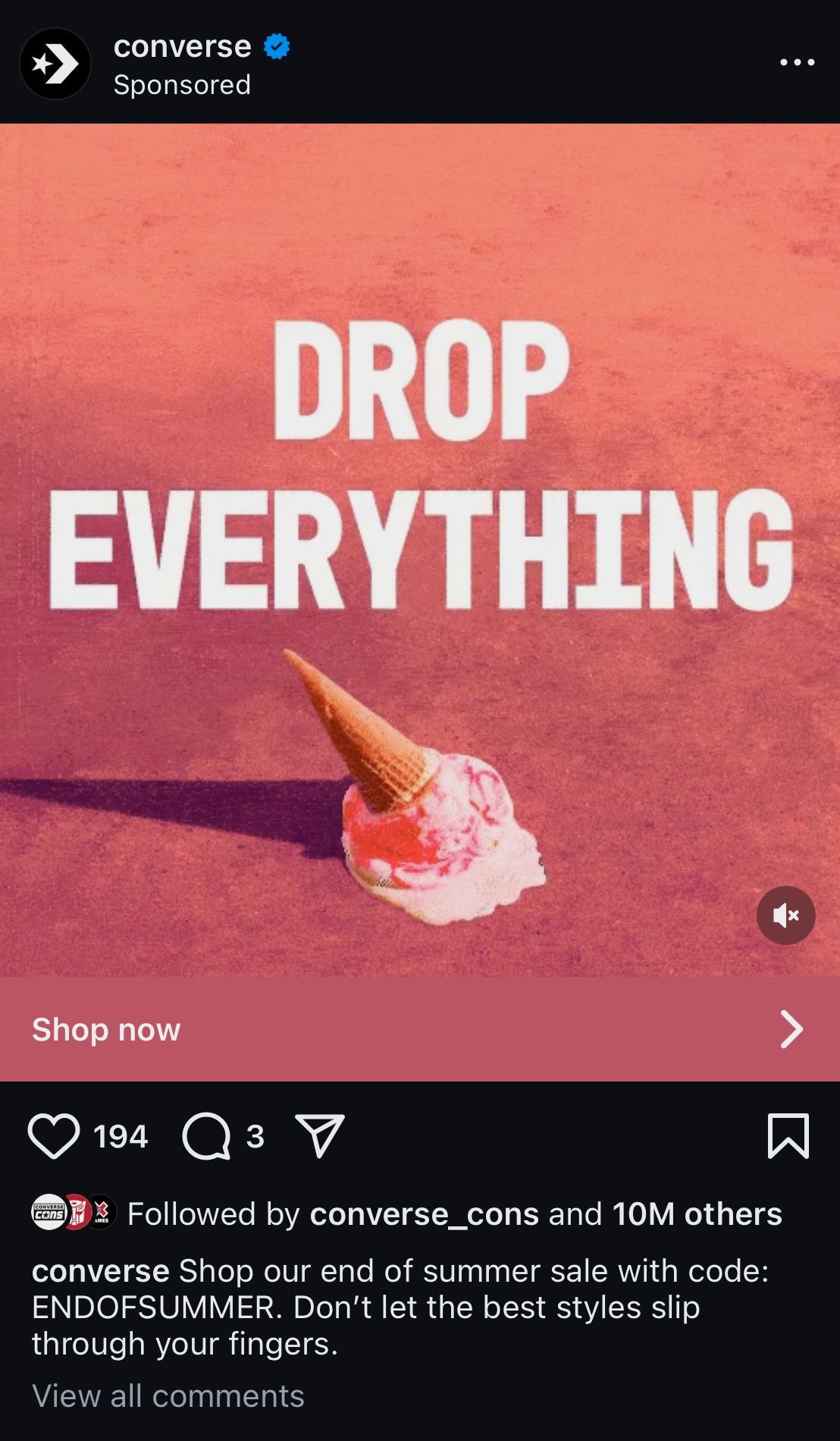
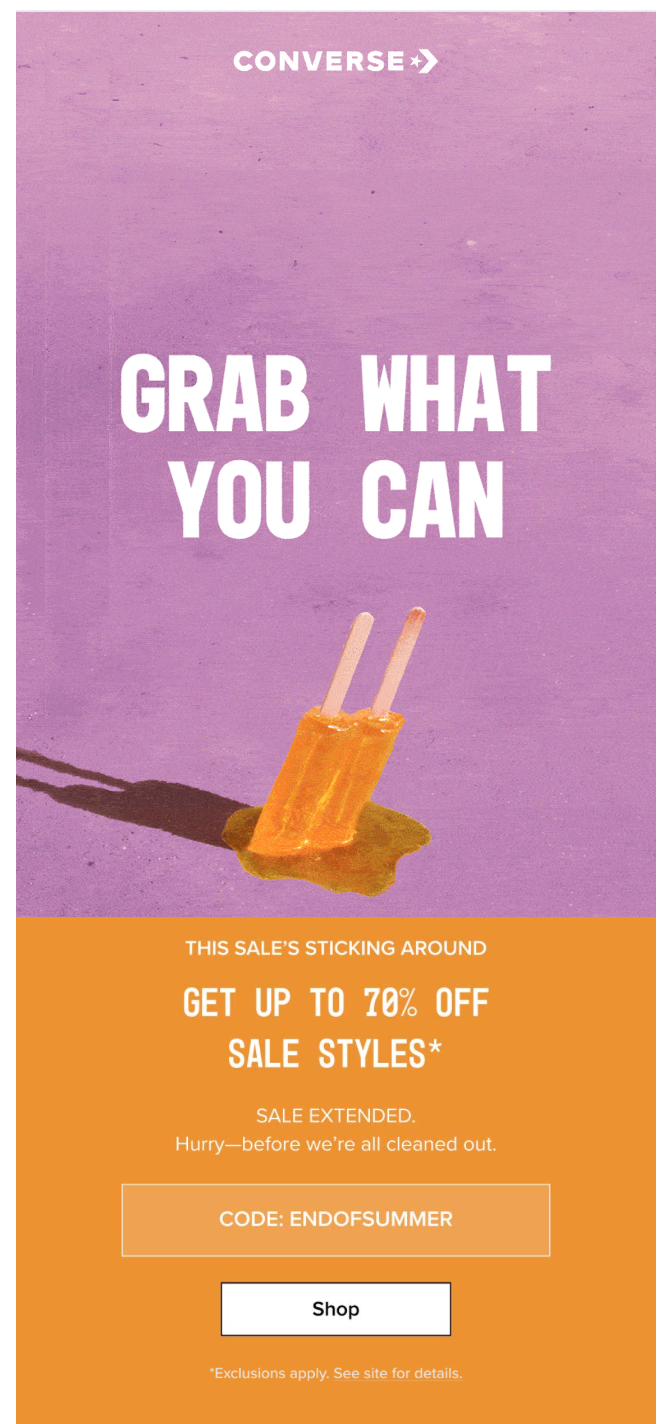
IG paid ad: End of summer sale
(Note: the image is a GIF including text: End of Summer Sale / Up to 70% off*) Here I tried to create a sense of urgency and match image.
email
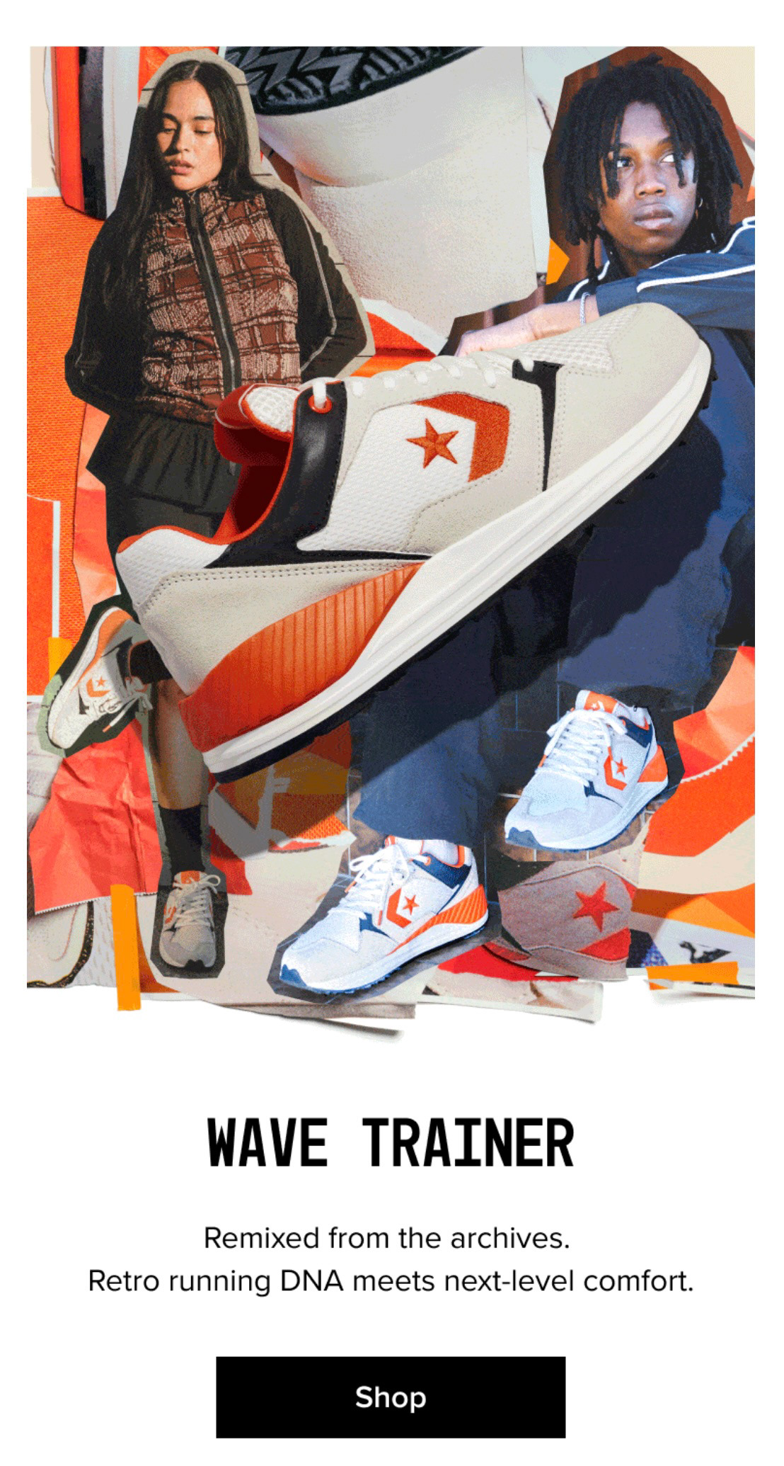
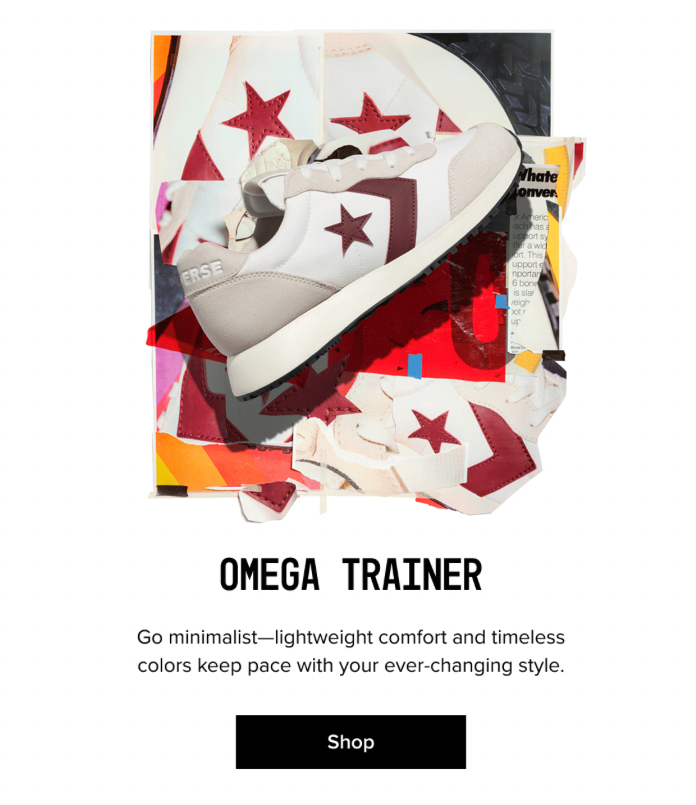
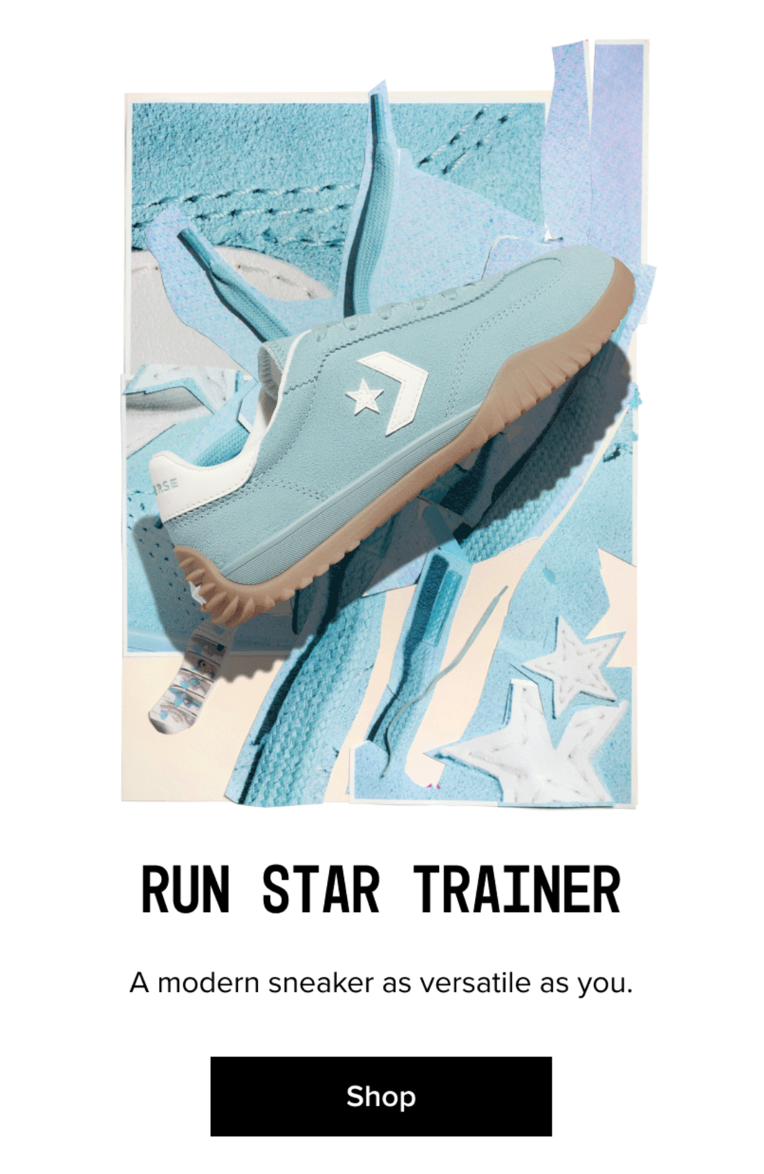
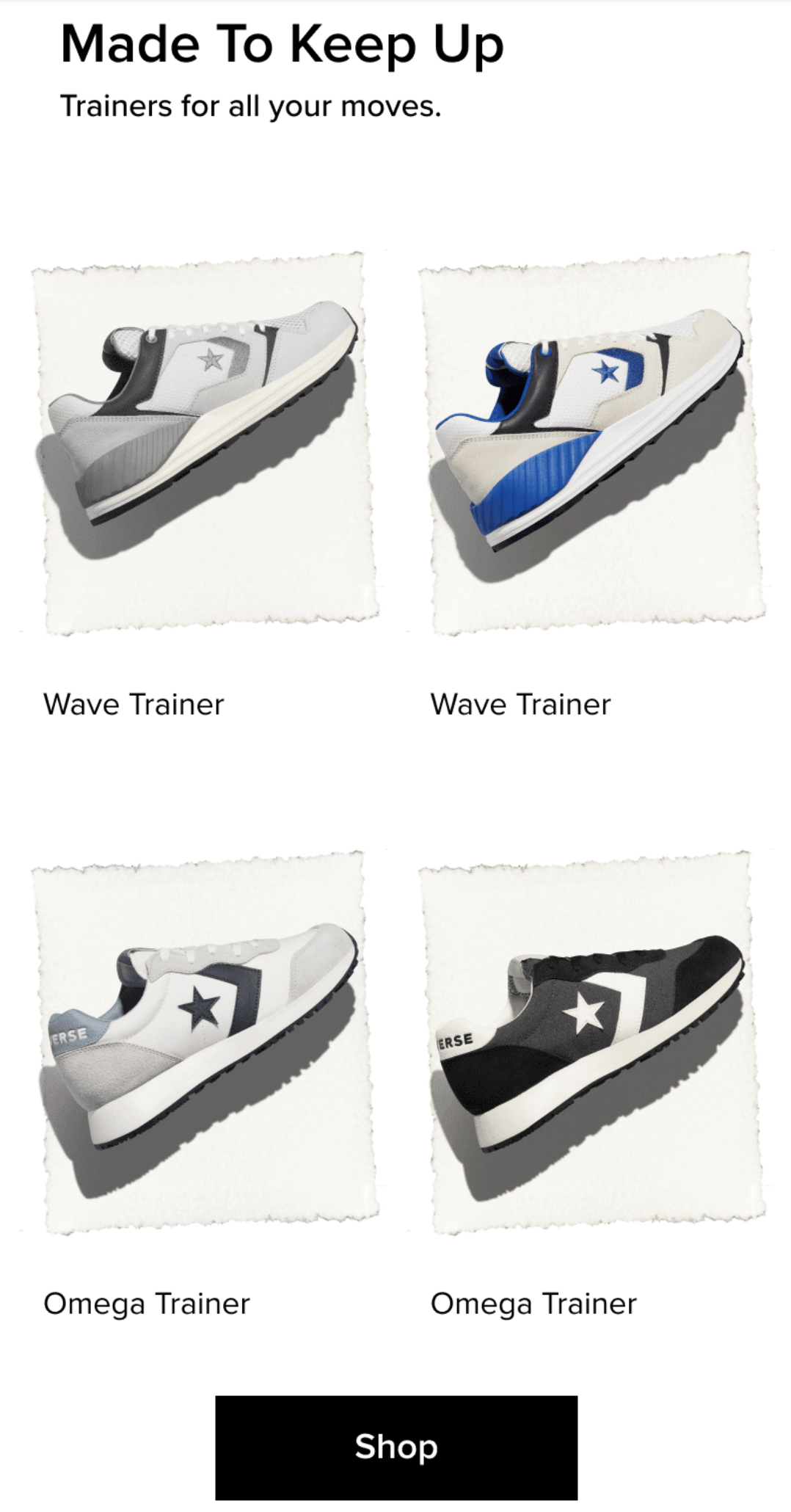
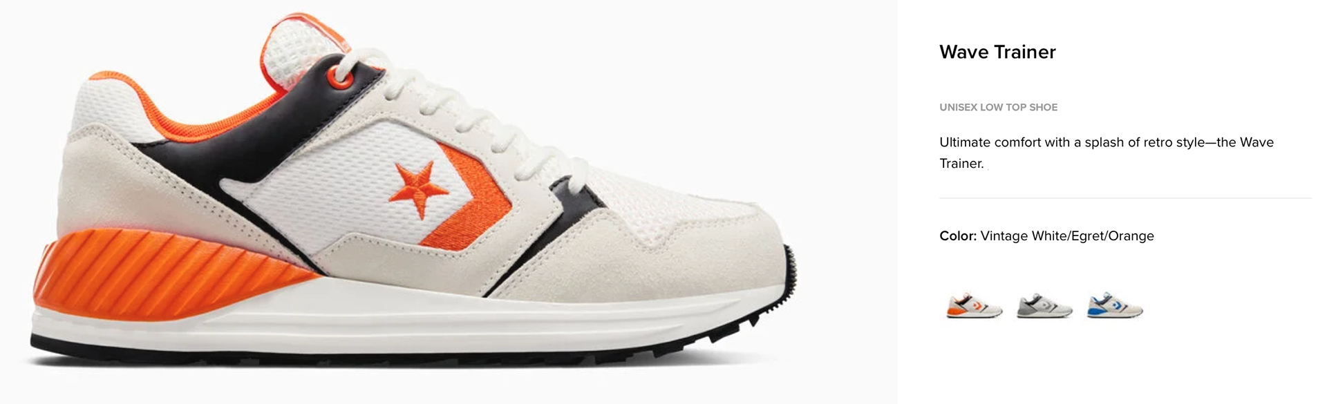
Email: introducing: The Wave Trainer & The omega Trainer
The challenge: introduce two new retro-inspired trainers rooted in Converse's running heritage—using the least amount of words possible.
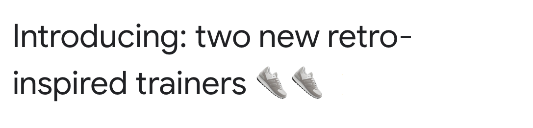
Pre-header: ...to keep up with all your moves
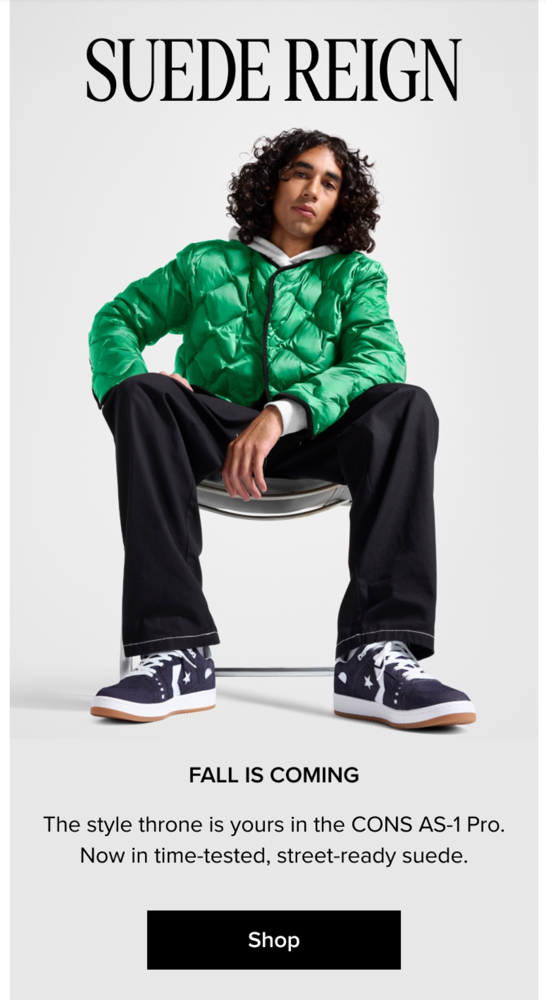
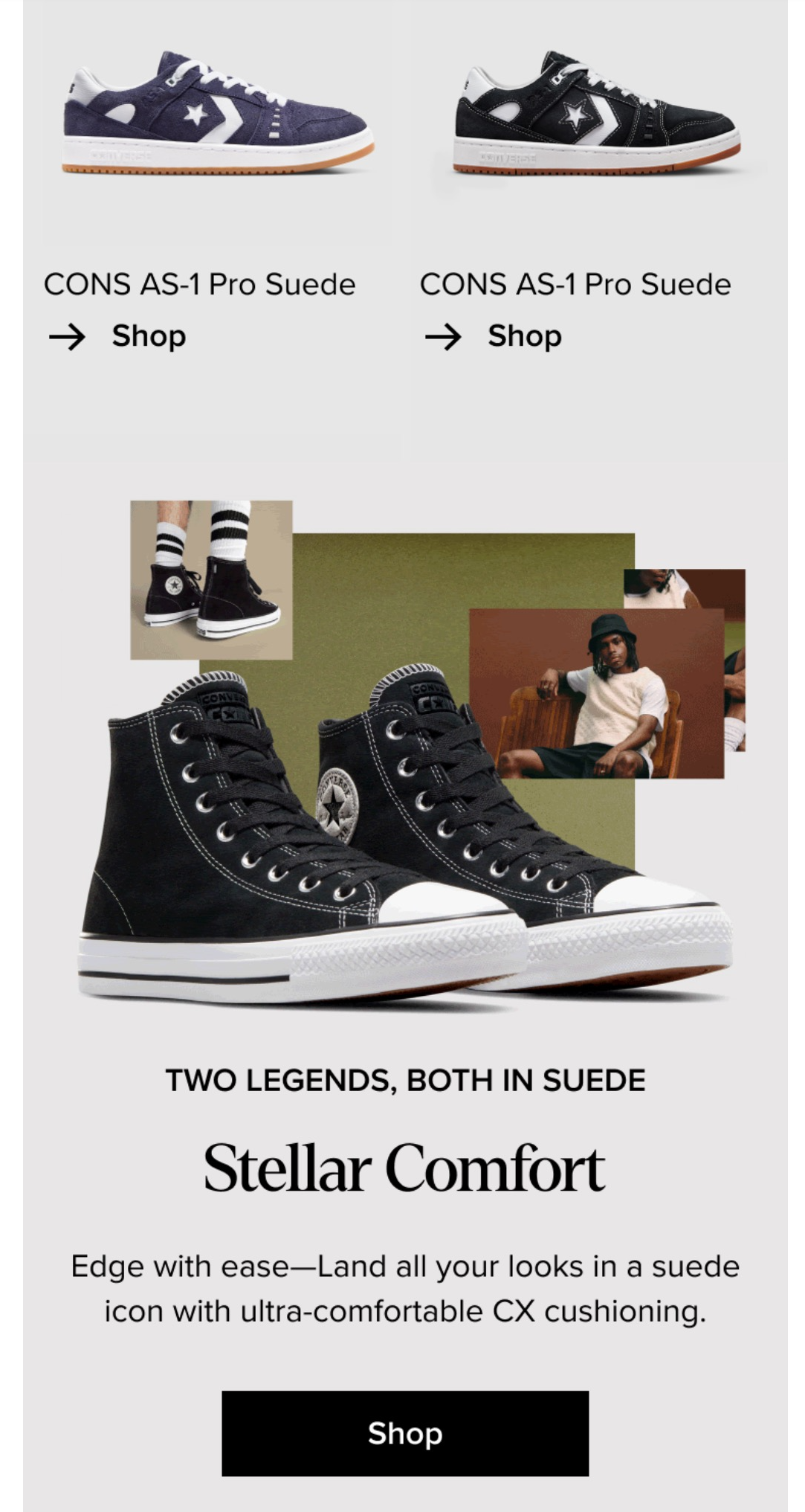
Email - Suede (Fall)
Biggest challenge: the content's passive—which doesn't always fire up my creativity. So I ran with the attitude of the photo.
When possible I try to let the content unlock the best story.
Speaking of "best stories," I might've been rewatching a certain fantasy series when I wrote this...

Pre-header: Get a look that goes with everything
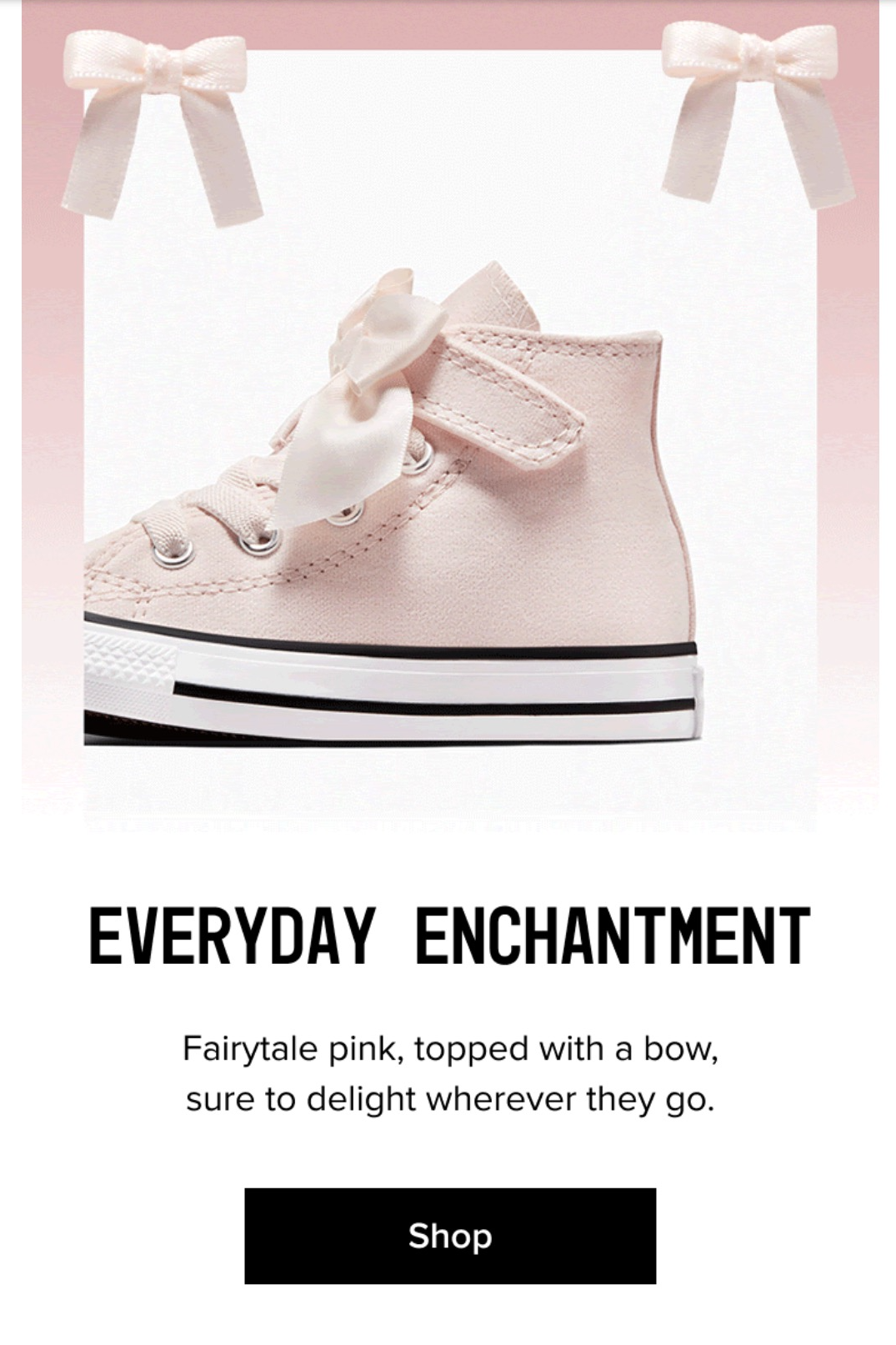
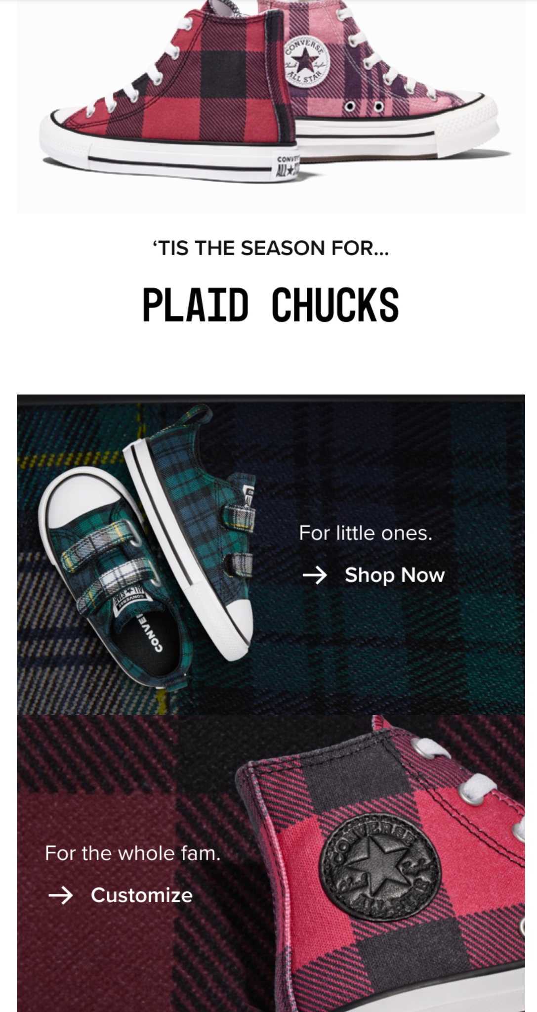
Email - kids' (winter)
One of the many fun things about writing for Converse was getting to explore my range as writer since there are so many categories/products.
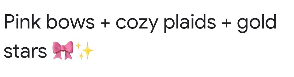
Pre-header: Chucks they'll love all winter are here
Email - End of summer sale - Early access / Sale extended
"Early access" and "last chance" emails for the End of Summer sale.

Early Access
Last Chance
product copy
As a product copywriter, I've written for DTC and B2B functions.
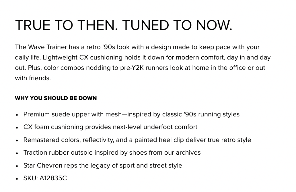
Wave Trainer
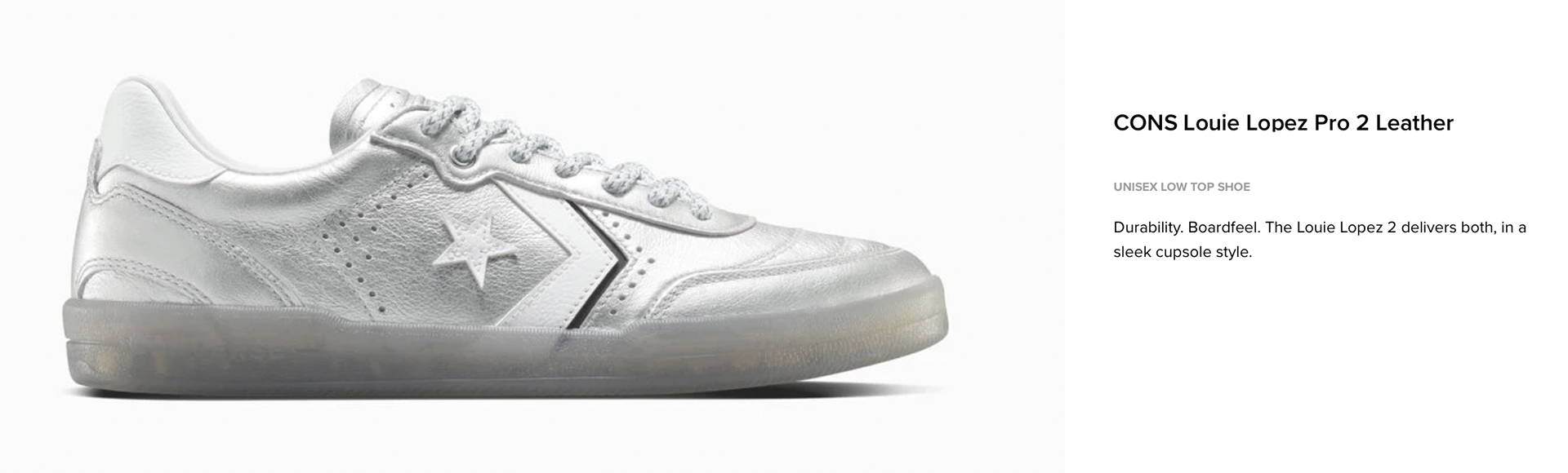
CONS Louie Lopez Pro 2
To liven up the storytelling, I zeroed in on what makes this shoe special (beyond the metallic colorway)—Louie's inspiration behind the design.
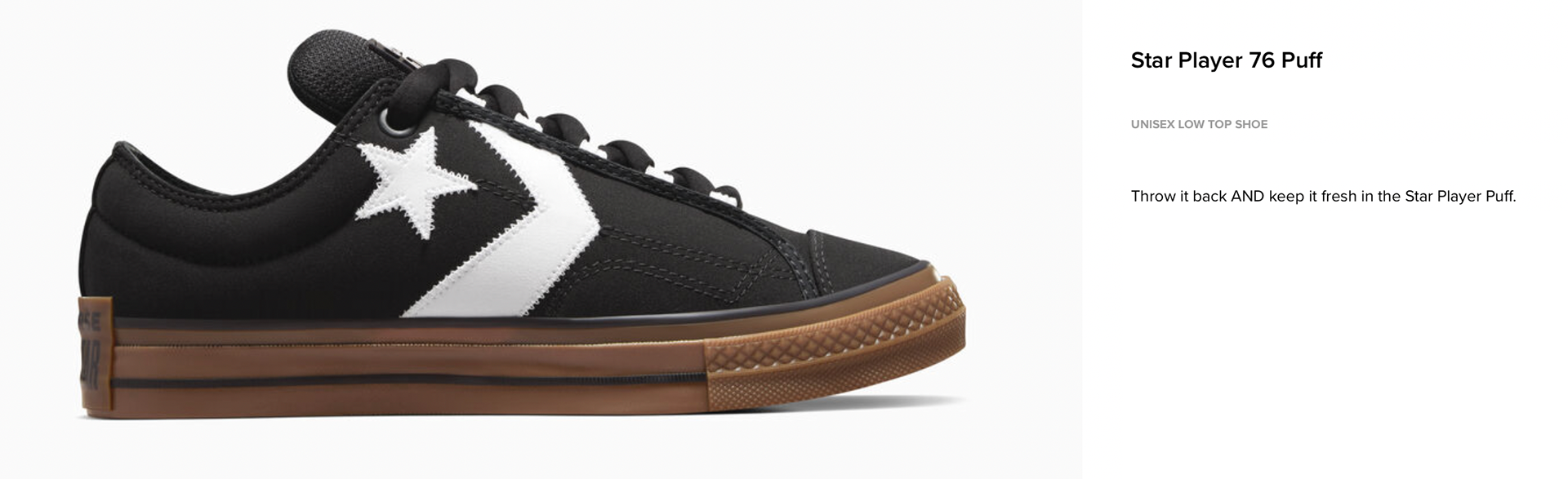
Star Player 76 puff
The shoe does most of the work. One look and you know if you can see yourself in it or not. So I kept the copy spare, with a hint of nostalgia.
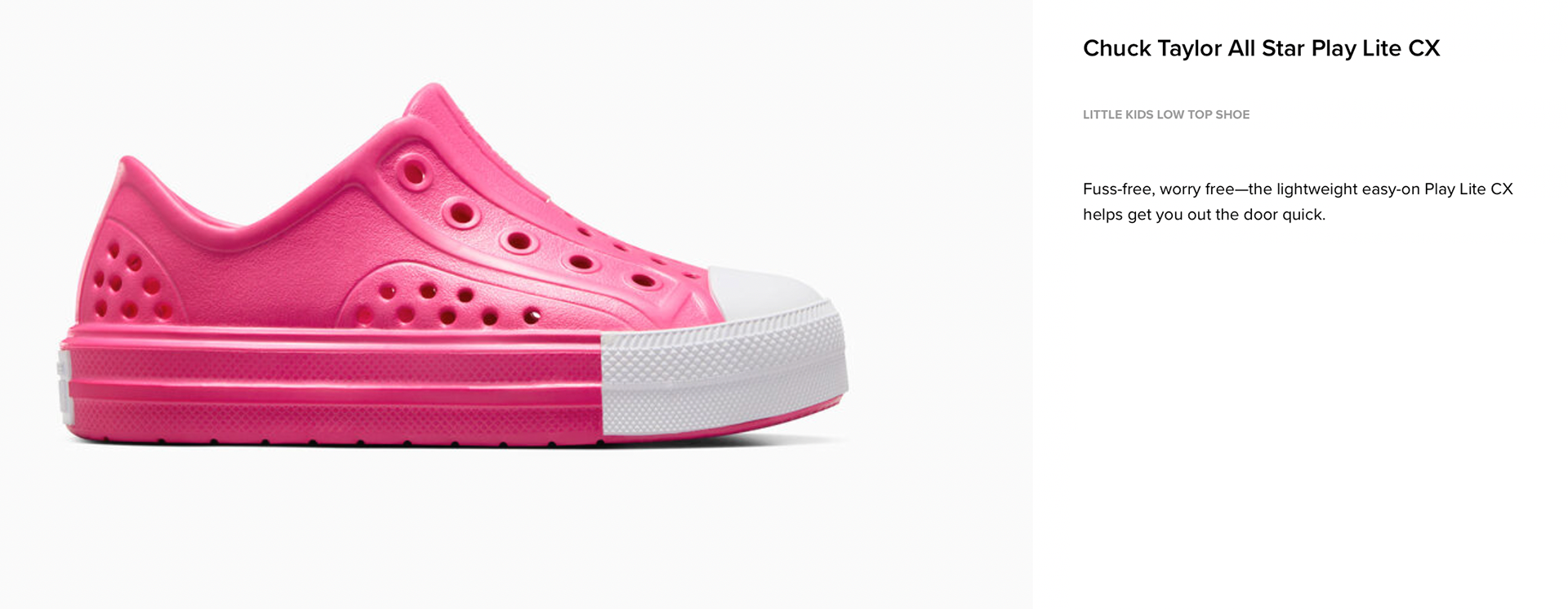
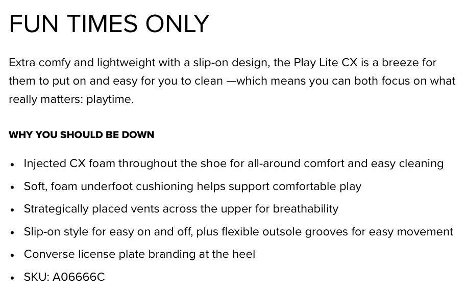
Chuck Taylor All Star Play Lite CX
To add more depth to the storytelling, I asked myself what the benefits actually mean for parents on an emotional level: more time.
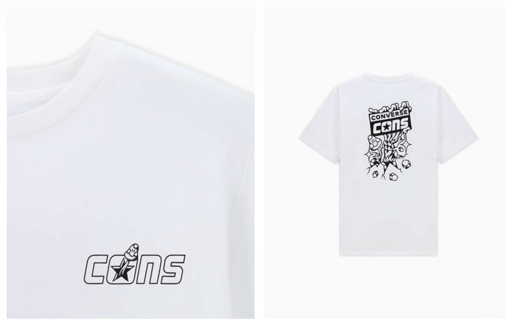
CONS skeleton hand t-shirt
Infused some goth spirit, but kept it tonally on-brand.
Elevated Product desc. page - BB ALL STAR SHIFT CX
The challenge: promoting a shoe in time for a global sporting event that I couldn't mention by name. Seen on a player who I also couldn't mention by name. (IYKYK, YK?)
Below is an example of the Converse Basketball landing page ("The Court Is Yours") and the elevated product page ("Nothing But "W" Vibes").
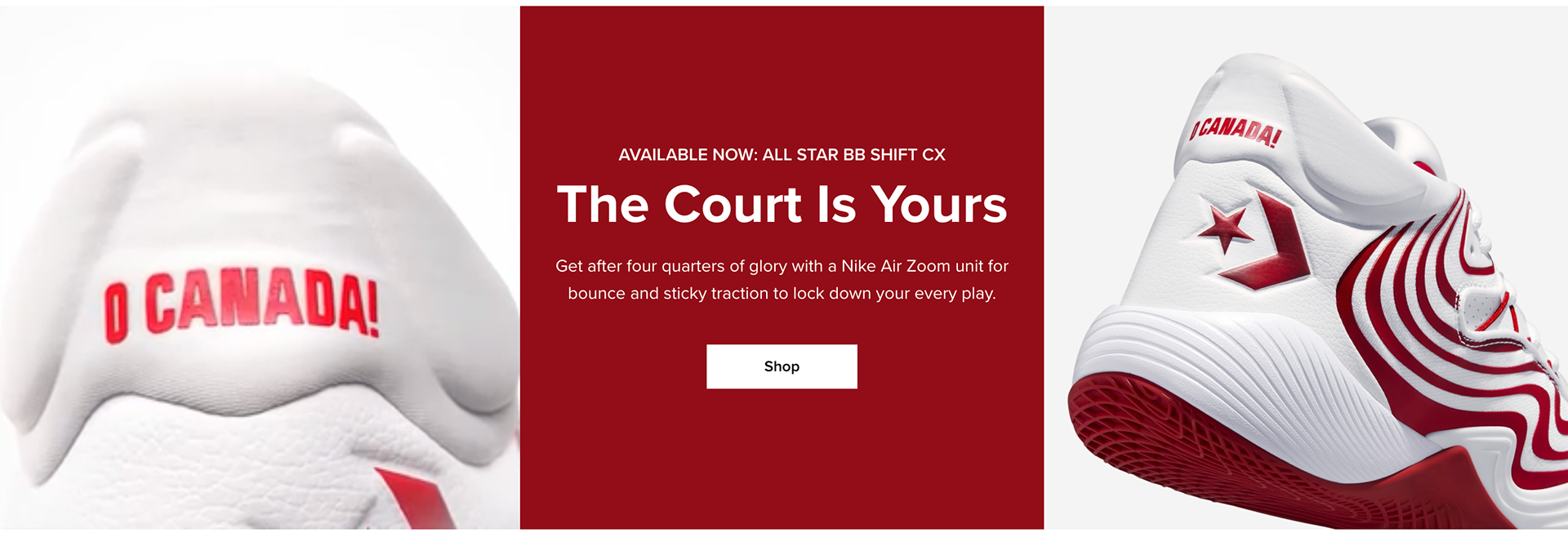
"Now Available" Landing Page

Elevated PDP

Elevated PDP
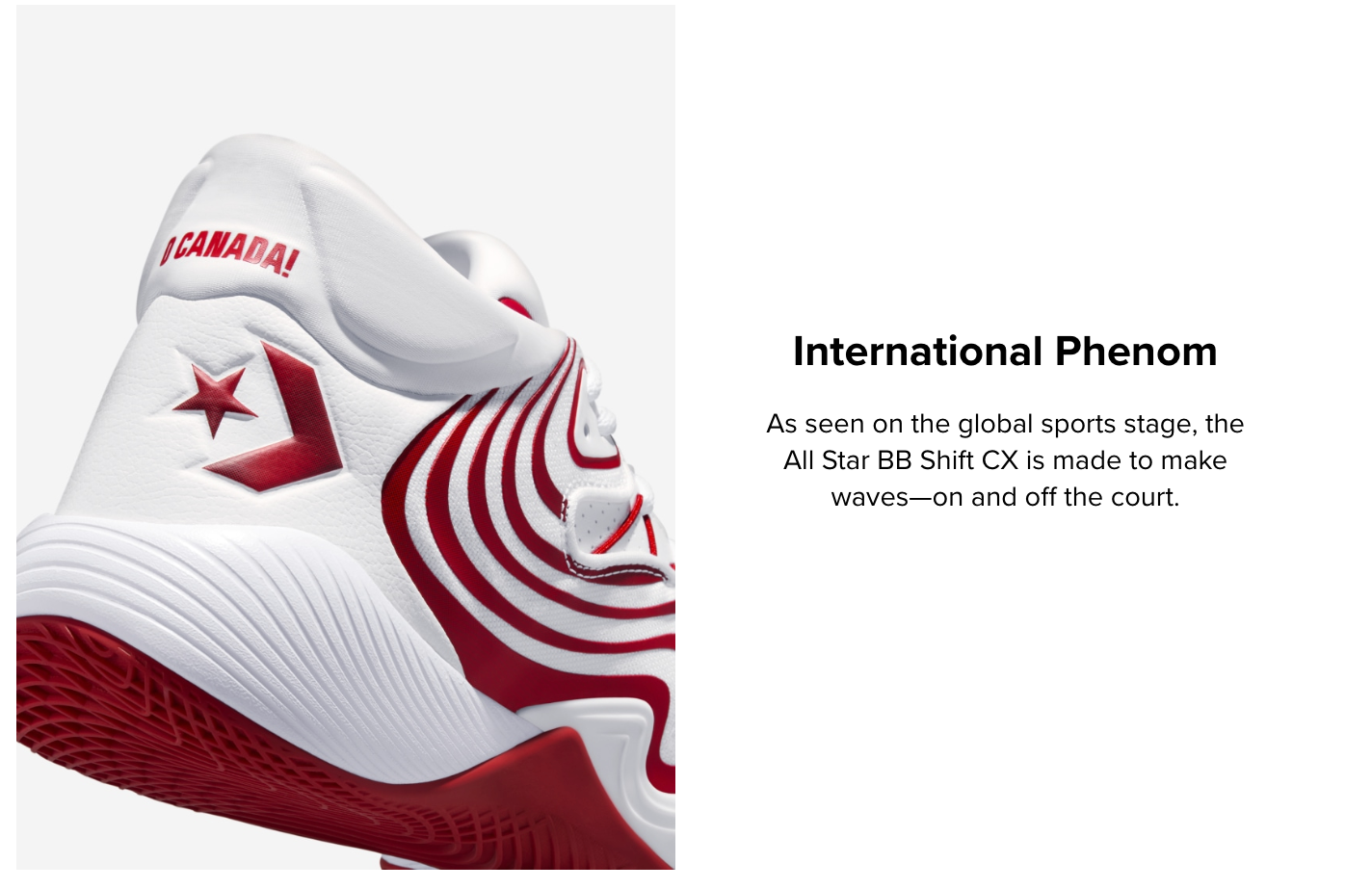
Elevated PDP
As a lifestyle copywriter for NYC-based rug company, Well Woven, I contributed short & long-form copy (SEO, email, social posts, etc.).
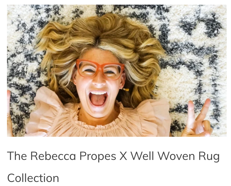
REBECCA PROPES X WELL WOVEN (long-form)
A contribution from a profile piece about DIY craft influencer, Rebecca Propes, for the launch of her collaboration with Well Woven.
Merry Maker: Rebecca Propes
Between NBC's hit show Making It and HGTV magazine's Jan/Feb. 2021 issue, one-of-a-kind designer Rebecca Propes has been covering a lot of ground lately. (As a rug company, covering ground is something we at Well Woven totally respect.)
Crafters, DIY designers, and anyone seeking a creative boost turn to Rebecca for her bold use of color, budget-friendly style, and "You can do it!" attitude.
Ourselves included.
Which is why we're all aflutter to announce the Rebecca Propes x Well Woven Rug Collection (AKA RP X WW)! The first additions to this collection are the Emerson and the Oliver, a sweet nod to Rebecca’s oldest and youngest sons!
Here's another bit on RP's background:
Make, Believe
Behind Rebecca's distinct peppy specks is more than a keen eye for design. Rebecca Propes is a loving wife, mom of three, and designer whose colorful personality matches her oodles of DIY projects.
It's no surprise Rebecca has amassed a design-loving following. Dip a toe into Rebecca's Insta or blog and, before you know it, you're swimming in design inspo! Rebecca's got imagination and moxie to spare. And she's not afraid to share it, which she does, like nobody's business.
Except, it's her business…
For nearly a decade, Rebecca has been running a shop, blogging about DIY projects, designing products, and dreaming up new printable ideas.
An avid DIY-er, Rebecca's also a craft cheerleader. Rebecca's infectious spirit and design expertise bedazzle her various social channels. She's got a natural knack for buoying flocks of the DIY-curious who might otherwise be craft shy.
Rebecca's superpower is her ability to demystify the creative process and make crafting accessible to anyone, anywhere, on any budget.
WATER X WELL WOVEN (Long-form)
A sample from another long-form piece for World Water Day to announce Well Woven's collaboration with charity: water.
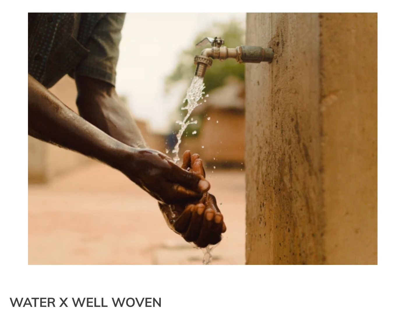
WATER X WELL WOVEN
The same way a great rug starts with a single thread, change starts with a single deed.
The water crisis is a world crisis. Every community deserves access to clean water. If we all lend a helping hand, we can all grow together.
Well Woven is excited to share that we are gifting a percent of proceeds to charity: water this year to build/fund multiple clean water projects throughout the next year!
WHY charity: water
When we see clean water, we see more kids in schools. We see more adults—especially women in these communities—working, growing, and thriving. We see more families spending time together in their homes. When we see clean water, we see brighter futures all around.
We also see all of you. Because at Well Woven, we believe if we work together, we can make a difference. Every team member, customer, partner, and family members has contributed to the ability to give back, and we have plenty more to do— together.
Over the course of these projects, our focus will be on the positive ripple effect in these communities beyond the biological and psychological benefits, clean water can help cut down on disease and really help under-served communities thrive.
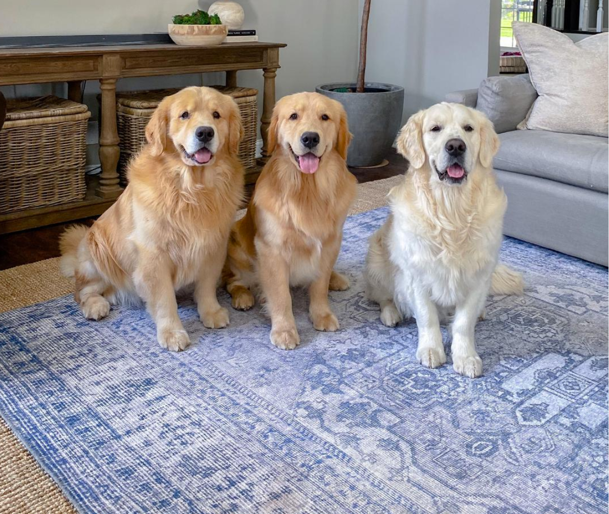
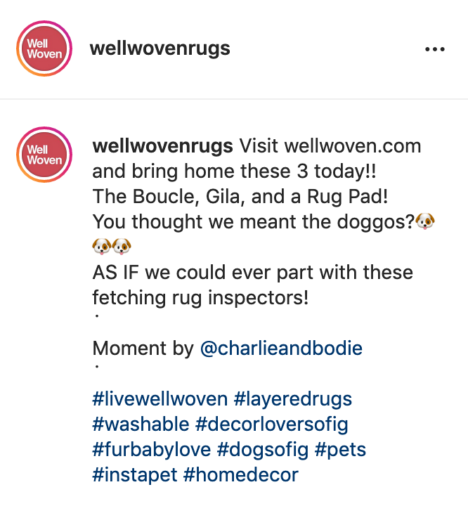
RUG Bundle (IG post)
I tried to have fun here with the idea of canine rug inspectors.
Valentine's Day Poems
For Valentine's Day, we wanted to try something different to promote machine-washable rugs. So I pitched the idea of putting our own spin on classic love poems. The team loved it, so we ran with it.
This Valentine’s Day, we're head over heels for our machine-washable rugs.
Because what’s not to love?
They give you that traditional rug look WITHOUT the hassle of traditional rug cleaning.
To get in the Valentine’s Day spirit, we took a few excerpts from classic love poems and gave them our own spin.
Ever wonder what "When You Are Old" by William Butler Yeats would've looked like if it were about a Well Woven GILA red machine-washable rug? We know we have.
Maybe it'd go a little something like this...
“WHEN YOU ARE (A FEW WEEKS) OLD”
...And sensing dirt on our Gila in red,
Murmur, not at all sadly, how Footprints
Leave no trace after a simple cold rinse,
and bid farewell once the dryer is fed.
Now what if a machine washable rug had been Shakespeare's muse when he penned “Shall I Compare Thee to a Summer's Day? (Sonnet 18)?"
“SHALL I WASH THEE ON A SUMMER'S DAY?"
Shall I take care of thee on Laundry Day?
Shall I take care of thee on Laundry Day?
Thou were lovely, and now…are so dirty.
My kids do play on you with toys all day,
And those rainy day paw prints are a mess
Sometime drops of juice or rosé I spot,
But knowing you can be washed, I don’t stress
...So to all accidents, or stains I can see,
Laundry fixes this, and this gives life to thee.
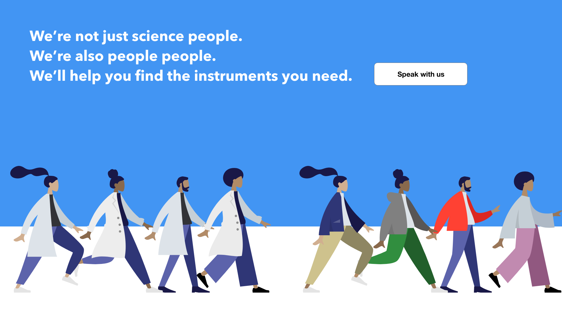
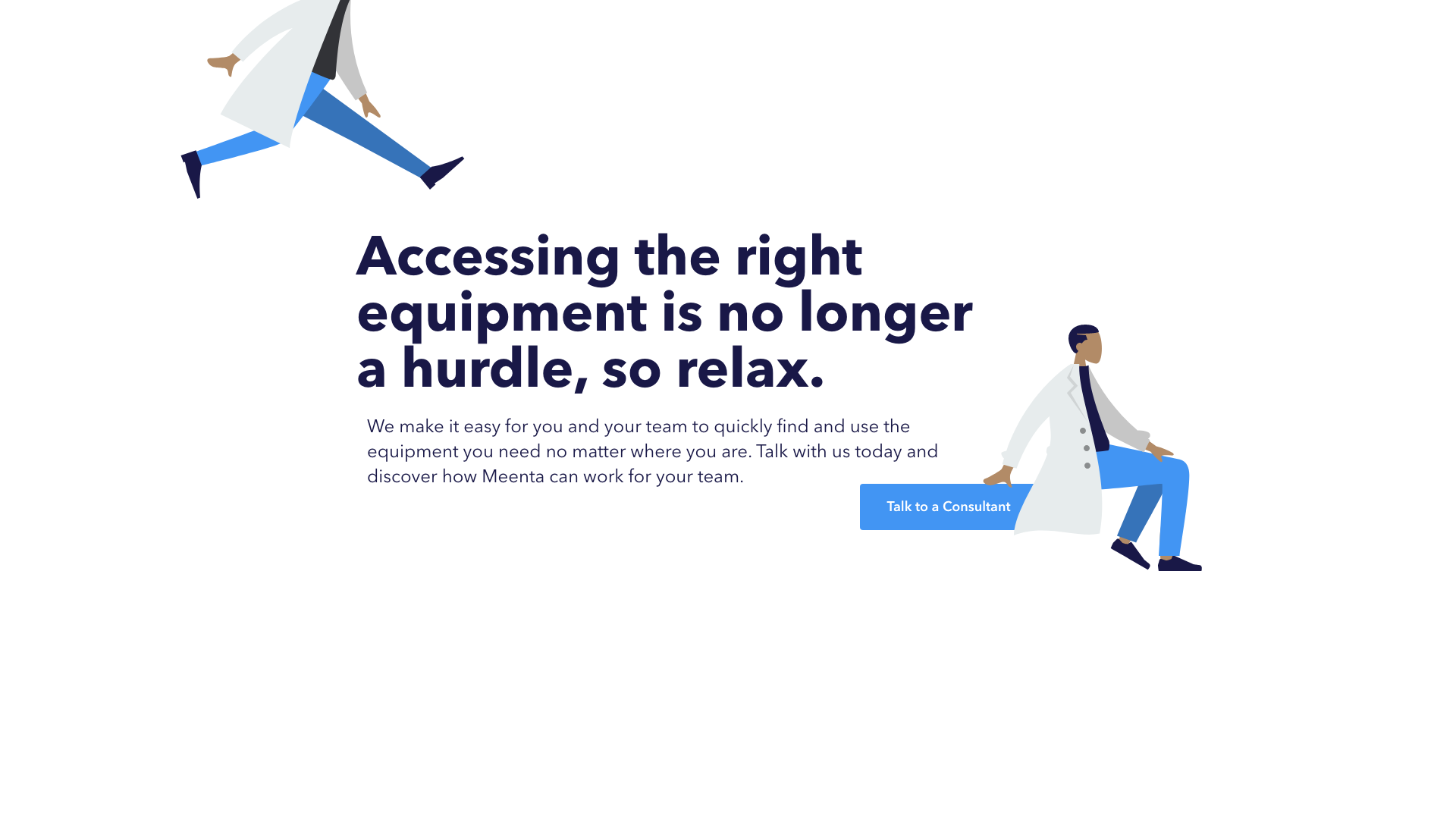
After taking a UX Design course in 2019, I worked as a UX Designer at Meenta, a biotech company (think AirBnB for lab equipment).
Being a small team, they asked me to write creative copy for some mockups for their site—and I haven't looked back since. (...Unless you count writing this.)
#1 - "Lab"
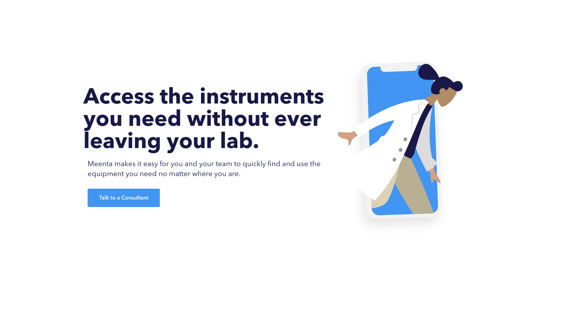
All vector art courtesy of https://www.humaaans.com
#2 - "Hurdle"
#3 - "Science-People People"